Ver mais / Ver menos
<JavaScript>
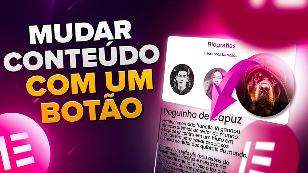
Classes e onde por
					<script src="https://code.jquery.com/jquery-3.6.0.min.js"></script>
<style>
.oculto {
    display: none;
}
</style>
<script type="text/javascript">
var $ = jQuery;

$(document).ready(function(){

    $('.ver-mais').on('click', function(event){
        event.preventDefault();
        $(this).toggleClass('oculto');
        $(this).closest('.cartao-perfil').find('.ver-menos, .detalhes').toggleClass('oculto');
    });

    $('.ver-menos').on('click', function(event){
        event.preventDefault();
        $(this).toggleClass('oculto');
        $(this).closest('.cartao-perfil').find('.ver-mais, .detalhes').toggleClass('oculto');
    });

});
</script>
					Instruções

Classes CSS
No botao Ver Mais:
ver-mais

No botão Ver menos:
ver-menos oculto

No conteiner onde estão as informações:
detalhes oculto

No conteiner principal:
cartao-perfil
Barra de carregamento que muda ao completar
<HTML>
<CSS>
<div class="text-message"
    style="font-family: poppins;
    font-size: 20px;
    font-weight: bold;
    text-align: center;">ISSO PODE LEVAR ATÉ 3 MINUTOS:</div>  <!-- AQUI VOCÊ DEVE MUDARA FONTE DO TEXTO SUPERIOR E TAMBÉM O TEXTO EM SI. -->


<div class="progress1">
    <div class="message"></div>
    <div class="progress-bar1">
        <span class="icon1"></span>
        <span class="countdown"></span>
    </div>
</div>

<script>
    const totalTime = 5; // tempo total em segundos
    const progressBar = document.querySelector('.progress1 .progress-bar1');
    const countdown = document.querySelector('.progress1 .countdown');
    const message = document.querySelector('.progress1 .message');

    let remainingTime = totalTime;
    let intervalId;

    message.textContent = "";
    message.style.fontFamily = "poppins";
    message.style.fontWeight = "bold";
    message.style.fontSize = "18px";
    message.style.textAlign = "center";

    intervalId = setInterval(() => {
        remainingTime--;
        const minutes = Math.floor(remainingTime / 60);
        const seconds = remainingTime % 60;
        countdown.textContent = `${minutes} min ${seconds.toFixed(1)} s`;
        progressBar.style.width = `${100 - remainingTime / totalTime * 100}%`;
        if (remainingTime === 0) {
            document.querySelector('.text-message').style.display = 'none';
            clearInterval(intervalId);
            progressBar.classList.add('finished');
            countdown.textContent = 'Já curte e Segue';
            message.style.display = "none";

        }
    }, 1000);
</script>
					    .progress1 {
        height: 22px;
        background-color: #ffffff;
        position: relative;
        overflow: hidden;
    }

    .progress1 .progress-bar1 {
        position: relative;
        height: 100%;
        background-color: red;
        animation: progress-animation1 5s forwards;
    }

    .progress1 .progress-bar1 .icon1 {
        position: absolute;
        top: -0px;
        right: 0;
        left: 0;
        width: 22px;
        padding-right: 10px;
        padding-left: 10px;
        margin-left: 3px;
        height: 25px;
        background-image: url('https://media.tenor.com/On7kvXhzml4AAAAj/loading-gif.gif');
        background-size: contain;
        background-repeat: no-repeat;
        animation: icon-animation1 0s forwards;
        overflow: hidden;
        z-index: 1;
    }

.progress1 .progress-bar1.finished {
  background-color: #48B000;
  background-image: linear-gradient(45deg, rgba(255,255,255,.15) 25%,transparent 25%,transparent 50%,rgba(255,255,255,.15) 50%,rgba(255,255,255,.15) 75%,transparent 75%,transparent);
  background-size: 22px 22px; /* altere o valor de acordo com a altura do elemento */
  animation: 1s linear infinite progress-bar-stripes;
}

@keyframes progress-bar-stripes {
  from {
    background-position: 1rem 0;
  }
  to {
    background-position: 0 0;
  }
}


    .progress1 .countdown {
        position: absolute;
        top: 50%;
        left: 50%;
        transform: translate(-50%, -50%);
        font-size: 12px;
        color: #ffffff;
        font-family: poppins;
        font-weight: bold;
        white-space: nowrap;
        text-align: center;
        font-size: 15px;

    }

    .progress1 .message {
        position: absolute;
        top: -50px;
        left: 0;
        right: 0;
        text-align: center;
        font-family: poppins, sans-serif;
        font-weight: bold;
        font-size: 18px;
    }

    @keyframes progress-animation1 {
        0% {
            width: 0%;
        }
        100% {
            width: 100%;
        }
    }

    @media screen and (max-width: 767px) {
        .progress1 .progress-bar1 {
            animation: progress-animation-mobile 5s forwards;
        }
    }

    @keyframes progress-animation-mobile {
        0% {
            width: 0%;
        }
        100% {
            width: 95.2%;
        }
    }

    @keyframes icon-animation1 {
        0% {
            left: 0%;
        }
        100% {
            left: 100%;
        }
    }
Barra lateral de rolagem
<HTML>
					body, html {
overflow-x: hidden !important;
}
body::-webkit-scrollbar {
    width: 10px; /* Tamanho da barra */
    background-color: #333333; /* Cor do fundo */
}
body::-webkit-scrollbar-thumb {
    border-radius: 10px; /* borda arredondada */
    background: linear-gradient(to bottom,
rgba(23,132,180,1) 10%, rgba(102,35,139,1) 50%,
rgba(204,1,155,1) 80%); /* cor em degrade */
}
Role a barra
Role a barra
Role a barra
Role a barra
Role a barra
Role a barra
Role a barra
Role a barra
Role a barra
Role a barra
Role a barra
Role a barra
Role a barra
Role a barra
Texto destacado
Esse é o seu
TEXTO DESTACADO.
Caixa de Texto
<CSS>
Esse é o seu texto <br><span class="destaque"><b>TEXTO DESTACADO</span></b>.
					.destaque {
  background: linear-gradient(100deg, #db204f, #834AFF);
  background-size: 200% 900%;
   animation: AnimationName 5s ease infinite;
    transform: scale(1);
  -webkit-background-clip: text;
  -webkit-text-fill-color: transparent;
}
@keyframes AnimationName {
    0%{background-position:0% 91%}
    50%{background-position:100% 10%}
    100%{background-position:0% 91%}
}
Hover Seletivo

<HTML>
<CSS>
					<script>
    const images = document.querySelectorAll('.image-container
img');

images.forEach(image => {
  image.addEventListener('mouseover', () => {
    images.forEach(img => img.classList.remove('active'));
    image.classList.add('active');
  });

  image.addEventListener('mouseout', () => {
    images.forEach(img => img.classList.remove('active'));
  });
});
</script>
					.image-container img {
  transition: transform 0.3s, op	acity 0.3s;
  opacity: 1;
}

.image-container img:hover {
  transform: scale(1.1);
  opacity: 1;
}

.image-container:hover img:not(:hover) {
  opacity: 0.3;
}
Classe CSS
image-container
Loading de alguns segundos antes de redirecionar para o forms

Me segue lá no Insta xD
<HTML>
<CSS>
					<!-- Define o conteúdo do loader -->
<div id="loader">
	<img decoding="async" src="https://media.tenor.com/On7kvXhzml4AAAAj/loading-gif.gif" alt="loading..."> <!-- Define a imagem do loader -->
	<p>Me segue lá no Insta xD</p> <!-- Define o texto abaixo da imagem -->
</div>

<script>
	/* Define a função que exibe o loader */
function showLoader() {
    var loader = document.querySelector('#loader'); /* Seleciona o loader */
    loader.classList.add('visible'); /* Adiciona a classe 'visible' para exibir o loader */
    setTimeout(function() {
        loader.classList.remove('visible'); /* Remove a classe 'visible' para esconder o loader após 5 segundos */
        window.location.href = '#1'; /* Redireciona para a próxima página */
    }, 5000);
}


	var form = document.querySelector('.elementor-form'); /* Seleciona o formulário */
	form.addEventListener('submit', showLoader); /* Adiciona um evento de submit para exibir o loader após o envio do formulário */
</script>
					selector .elementor-button {
    border-top-left-radius: 20px 100% !important;
    border-bottom-left-radius: 20px 100% !important;
    border-top-right-radius: 20px 100% !important;
    border-bottom-right-radius: 20px 100% !important;
    box-shadow: inset 0px 0px 5px 5px #ff0000, 0px 5px 5px 0px #980000 !important;
  width: 100%;
  position: relative;
  background: #ff0000 !important;
  box-shadow: inset 0px 0px 4px 2px #980000, 0 0 30px 5px rgba(255, 0, 0, 0.815) !important;
  -webkit-transition: all 0.2s ease-out;
  -moz-transition: all 0.2s ease-out;
  border-radius: 5px;
  border: none !important;
  overflow: hidden;
  -webkit-transition: all 0.2s ease-in;
  -moz-transition: all 0.2s ease-in;
  transition: all 0.2s ease-in;
  padding: 10px;
}

selector .elementor-button:hover {
  background: #ff0000 !important;
  border: none;
  box-shadow: inset 0px 0px 5px 5px #980000, 0 0 30px 5px rgba(255, 0, 0, 0.815) !important;
  -webkit-transition: all 0.2s ease-out;
  -moz-transition: all 0.2s ease-out;
  transform: scale(1.03);
  transition: all 0.2s ease-out;
}

selector .elementor-button:hover::before {
  -webkit-animation: sh02 0.5s 0s linear;
  -moz-animation: sh02 0.5s 0s linear;
  animation: sh02 0.7s 0s linear;
}

selector .elementor-button::before {
  content: '';
  display: block;
  width: 0px;
  height: 86%;
  position: absolute;
  top: 7%;
  left: 0%;
  opacity: 0;
  background: #fff;
  box-shadow: 0 0 50px 30px #fff;
  -webkit-transform: skewX(-20deg);
  -moz-transform: skewX(-20deg);
  -ms-transform: skewX(-20deg);
  -o-transform: skewX(-20deg);
  transform: skewX(-20deg);
}

@keyframes sh02 {
  from {
    opacity: 0;
    left: 0%;
  }

  50% {
    opacity: 1;
  }

  to {
    opacity: 0;
    left: 100%;
  }
}

selector .elementor-button:active {
  box-shadow: inset 0px 0px 5px 5px #980000, 0 0 0 0 transparent !important;
  -webkit-transition: box-shadow 0.2s ease-in;
  -moz-transition: box-shadow 0.2s ease-in;
  transition: box-shadow 0.2s ease-in;
  transform: translate(0, 0.2em);
}
Botão Tech – Estilo MSI
<HTML>
<CSS>
					<!-- Botão Tech cadenciado por Luan Montenegro. Inspirado no RSI -->

<a href="#" class="botao-tech1">
  <div class="hexagon-front"></div>
  <div class="hexagon-back"></div>
  <span>Botão Tech Luan</span>
</a>
					/*para desktop ----------------------------------------------------------*/

@media (min-width: 1024px){

.botao-tech1 {

  display: inline-flex;
  position: relative;
  text-align: center;
  font-size: 22px;
  text-transform: uppercase;
  color: #fff;
  text-decoration: none;
  padding: 20px 40px 25px 70px;
  align-items: center;
  font-family: share tech mono;
  transition: color 0.3s ease; /* transição suave */
  font-weight: bld;
  filter: hue-rotate(70deg) saturate(100%);
  transition: filter 0.3s ease;
}
.botao-tech1:hover {
  color: #fff;
  text-decoration: none;
  font-weight: bold;
  filter: hue-rotate(90deg) saturate(200%);
  transition: filter 0.3s ease;

}

.botao-tech1.btn-small {
  font-size: 14px;
  padding: 10px 20px;
  /* Código por Luan Montenegro. Inspirado em RSI
  contato Whatsapp: 73 98229-7961
  website: luanmontenegro.com
  behance: https://www.behance.net/luanmontenegro*/
}

.botao-tech1.btn-large {
  font-size: 24px;
  padding: 30px 60px;
}

.botao-tech1 .hexagon-front {
  position: absolute;
  top: 02px;
  left: 03px;
  width: calc(100% - 13px);
  height: calc(100% - 12px);
  z-index: 2;
  border: 1px solid transparent;
  border-image-source: url('https://luanmontenegro.com/wp-content/uploads/2023/06/Botao-Front-1.svg');
  border-image-slice: 20 20 fill;
  border-image-width: 100px;
  transform: translateX(0) translateY(0);
  transition: all 0.3s ease;
}

.botao-tech1:hover .hexagon-front {
  transform: translateX(20px) translateY(-0px);
  transition-delay: 0.2s;
}

.botao-tech1 .hexagon-back {
  position: absolute;
  top: 0;
  left: 0;
  width: calc(100% + 34px);
  height: calc(100% + 34px);
  z-index: 1;
  border: 1px solid transparent;
  border-image-source: url('https://luanmontenegro.com/wp-content/uploads/2023/06/Botao-Back-1.svg');
  border-image-slice: 39 39 fill;
  border-image-width: 100px;
  transform: translateX(5px) translateY(5px);
  transition: all 0.3s ease;
}

.botao-tech1:hover .hexagon-back {
  transform: translateX(0) translateY(-20px);
}

.botao-tech1 span {
  position: relative;
  z-index: 3;
}
}

/*para mobile ----------------------------------------------------------*/

@media (max-width: 767px){
.botao-tech1 {

  display: inline-flex;
  position: relative;
  text-align: center;
  font-size: 22px;
  text-transform: uppercase;
  color: #fff;
  text-decoration: none;
  padding: 20px 40px 25px 70px;
  align-items: center;
  font-family: share tech mono;
  transition: color 0.3s ease; /* transição suave */
  font-weight: bld;
  filter: hue-rotate(70deg) saturate(100%);
  transition: filter 0.3s ease;
}
.botao-tech1:hover {
  color: #fff;
  text-decoration: none;
  font-weight: bold;
  filter: hue-rotate(90deg) saturate(200%);
  transition: filter 0.3s ease;

}

.botao-tech1.btn-small {
  font-size: 14px;
  padding: 10px 20px;
  /* Código por Luan Montenegro. Inspirado em RSI
  contato Whatsapp: 73 98229-7961
  website: luanmontenegro.com
  behance: https://www.behance.net/luanmontenegro*/
}

.botao-tech1.btn-large {
  font-size: 24px;
  padding: 30px 60px;
}

.botao-tech1 .hexagon-front {
  position: absolute;
  top: 02px;
  left: 03px;
  width: calc(100% - 13px);
  height: calc(100% - 12px);
  z-index: 2;
  border: 1px solid transparent;
  border-image-source: url('https://luanmontenegro.com/wp-content/uploads/2023/06/Botao-Front-1.svg');
  border-image-slice: 20 20 fill;
  border-image-width: 100px;
  transition: all 0s ease;
}

.botao-tech1:hover .hexagon-front {
  transform: translateX(20px) translateY(-0px);
  transition-delay: 0s;
}

.botao-tech1 .hexagon-back {
  position: absolute;
  top: 0;
  left: 0;
  width: calc(100% + 34px);
  height: calc(100% + 34px);
  z-index: 1;
  border: 1px solid transparent;
  border-image-source: url('https://luanmontenegro.com/wp-content/uploads/2023/06/Botao-Back-1.svg');
  border-image-slice: 39 39 fill;
  border-image-width: 100px;

}

.botao-tech1:hover .hexagon-back {
  transform: translateX(0) translateY(-20px);
}

.botao-tech1 span {
  position: relative;
  z-index: 3;
}

}

/*para tablet ----------------------------------------------------------*/

@media (min-width: 760px) and (max-width: 1023px){
    .botao-tech1 {

  display: inline-flex;
  position: relative;
  text-align: center;
  font-size: 22px;
  text-transform: uppercase;
  color: #fff;
  text-decoration: none;
  padding: 20px 40px 25px 60px;
  align-items: center;
  font-family: share tech mono;
  transition: color 0.3s ease; /* transição suave */
  font-weight: bld;
  filter: hue-rotate(70deg) saturate(100%);
  transition: filter 0.3s ease;
}
.botao-tech1:hover {
  color: #fff;
  text-decoration: none;
  font-weight: bold;
  filter: hue-rotate(90deg) saturate(200%);
  transition: filter 0.3s ease;

}

.botao-tech1.btn-small {
  font-size: 14px;
  padding: 10px 20px;
  /* Código por Luan Montenegro. Inspirado em RSI
  contato Whatsapp: 73 98229-7961
  website: luanmontenegro.com
  behance: https://www.behance.net/luanmontenegro*/
}

.botao-tech.btn-large {
  font-size: 24px;
  padding: 30px 60px;
}

.botao-tech1 .hexagon-front {
  position: absolute;
  top: 02px;
  left: 03px;
  width: calc(100% - 13px);
  height: calc(100% - 12px);
  z-index: 2;
  border: 1px solid transparent;
  border-image-source: url('https://luanmontenegro.com/wp-content/uploads/2023/06/Botao-Front-1.svg');
  border-image-slice: 20 20 fill;
  border-image-width: 100px;
  transform: translateX(0) translateY(0);
  transition: all 0.3s ease;
}

.botao-tech1:hover .hexagon-front {
  transform: translateX(20px) translateY(-0px);
  transition-delay: 0.2s;
}

.botao-tech1 .hexagon-back {
  position: absolute;
  top: 0;
  left: 0;
  width: calc(100% + 34px);
  height: calc(100% + 34px);
  z-index: 1;
  border: 1px solid transparent;
  border-image-source: url('https://luanmontenegro.com/wp-content/uploads/2023/06/Botao-Back-1.svg');
  border-image-slice: 39 39 fill;
  border-image-width: 100px;
  transform: translateX(5px) translateY(5px);
  transition: all 0.3s ease;
}

.botao-tech1:hover .hexagon-back {
  transform: translateX(0) translateY(-20px);
}

.botao-tech1 span {
  position: relative;
  z-index: 3;
}

}


<HTML> CPF
<CSS> CPF
					<script src="https://cdnjs.cloudflare.com/ajax/libs/jquery.mask/1.14.16/jquery.mask.min.js"></script>
<div id="cpf-error">Digite um CPF válido</div>

<script>
jQuery(document).ready(function(){
    var cpf_field = '#form-field-cpf';
    var submit_button = '.elementor-field-group.elementor-column.elementor-field-type-submit.elementor-col-100.e-form__buttons button';

    // Função para aplicar a máscara de CPF
    function applyMask(value) {
        return value
            .replace(/\D/g, '')  // Remove caracteres não numéricos
            .replace(/(\d{3})(\d)/, '$1.$2')  // Adiciona o ponto
            .replace(/(\d{3})(\d)/, '$1.$2')  // Adiciona o ponto
            .replace(/(\d{3})(\d)/, '$1.$2')  // Adiciona o ponto
            .replace(/(\d{3})(\d{1,2})$/, '$1-$2'); // Adiciona o hífen
    }
    // Aplicar a máscara ao valor do campo
    function formatCPF() {
        var rawValue = jQuery(cpf_field).val().replace(/\D/g, ''); // Remove caracteres não numéricos
        var formattedValue = applyMask(rawValue);
        jQuery(cpf_field).val(formattedValue);
    }
    jQuery(cpf_field).on('input blur', function(){
        formatCPF();
        var cpf = jQuery(cpf_field).val().replace(/\D/g, ''); // Remove caracteres não numéricos
        var errorBalloon = jQuery('#cpf-error');
        var isValid = cpf.length === 11 && isValidCPF(cpf);

        if (isValid) {
            errorBalloon.hide();
            jQuery(cpf_field).css("border", "2px solid green");
            jQuery(submit_button).prop('disabled', false); // Enable the submit button
        } else {
            errorBalloon.show();
            jQuery(cpf_field).css("border", "2px solid red");
            jQuery(submit_button).prop('disabled', true); // Disable the submit button
        }
    });
    function isValidCPF(cpf) {
        if (/^(\d)\1{10}$/.test(cpf)) return false;

        var sum = 0;
        for (var i = 1; i <= 9; i++) {
            sum += parseInt(cpf.substring(i - 1, i)) * (11 - i);
        }

        var remainder = (sum * 10) % 11;
        if ((remainder === 10) || (remainder === 11)) remainder = 0;
        if (remainder !== parseInt(cpf.substring(9, 10))) return false;
        sum = 0;
        for (var i = 1; i <= 10; i++) {
            sum += parseInt(cpf.substring(i - 1, i)) * (12 - i);
        }
        remainder = (sum * 10) % 11;
        if ((remainder === 10) || (remainder === 11)) remainder = 0;
        if (remainder !== parseInt(cpf.substring(10, 11))) return false;

        return true;
    }
});
</script>
					#cpf-error {
    display: none;
    top: -80px;
    left: 30px; /* Ajustar conforme necessário */
    color: red;
    background-color: white;
    border-radius: 5px;
    border: 1px solid red;
    padding: 5px;
    position: absolute;
    z-index: 1000;
    width: 170px;
    margin-top: 5px; /* Espaçamento entre o campo e o balão de erro */
}

#cpf-error::before {
    content: '';
    position: absolute;
    top: -10px;
    left: 20px; /* Ajustar conforme necessário */
    border-width: 5px;
    border-style: solid;
    border-color: transparent transparent red transparent;
}
.elementor-field-group.elementor-column.elementor-field-type-submit.elementor-col-100.e-form__buttons button:disabled {
    opacity: 0.3;
    filter: saturate(0.7);
    cursor: not-allowed;
}
<HTML> Celular
<CSS> Celular
					<script src="https://cdnjs.cloudflare.com/ajax/libs/jquery.mask/1.14.16/jquery.mask.min.js"></script>
<div id="celular-error">Digite um celular válido</div>

<script>
jQuery(document).ready(function(){
    var celular_field = '#form-field-celular';
    var submit_button = '.elementor-field-group.elementor-column.elementor-field-type-submit.elementor-col-100.e-form__buttons button';

    // Função para aplicar a máscara de celular
    function applyMask(value) {
        return value
            .replace(/\D/g, '')  // Remove caracteres não numéricos
            .replace(/(\d{2})(\d)/, '($1) $2')  // Adiciona o parêntese e espaço
            .replace(/(\d{4})(\d{4})/, '$1-$2'); // Adiciona o hífen
    }

    // Aplicar a máscara ao valor do campo
    function formatCelular() {
        var rawValue = jQuery(celular_field).val().replace(/\D/g, ''); // Remove caracteres não numéricos
        if (rawValue.length > 11) rawValue = rawValue.slice(0, 11); // Limita o comprimento a 11 dígitos
        var formattedValue = applyMask(rawValue);
        jQuery(celular_field).val(formattedValue);
    }

    jQuery(celular_field).on('input blur', function(){
        formatCelular();
        var celular = jQuery(celular_field).val().replace(/\D/g, ''); // Remove caracteres não numéricos
        var errorBalloon = jQuery('#celular-error');
        var isValid = (celular.length === 10 || celular.length === 11) && isValidCelular(celular);

        if (isValid) {
            errorBalloon.hide();
            jQuery(celular_field).css("border", "2px solid green");
            jQuery(submit_button).prop('disabled', false); // Enable the submit button
        } else {
            errorBalloon.show();
            jQuery(celular_field).css("border", "2px solid red");
            jQuery(submit_button).prop('disabled', true); // Disable the submit button
        }
    });

    function isValidCelular(celular) {
        // Verificar se o número é uma sequência de dígitos repetidos
        if (/^(\d)\1{7,10}$/.test(celular)) return false;

        // Lista de números de celular conhecidos como falsos
        var falseNumbers = [
            '0000000000', '1111111111', '2222222222', '3333333333',
            '4444444444', '5555555555', '6666666666', '7777777777',
            '8888888888', '9999999999', '1234567890', '9876543210',
            '0123456789', '0987654321', '1231231231', '3213213210',
            '99999999999', '00000000000', '12345678901', '98765432109',
            '111111111', '222222222', '333333333', '444444444',
            '555555555', '666666666', '777777777', '888888888',
            '999999999', '1000000000', '2000000000', '3000000000',
            '4000000000', '5000000000', '6000000000', '7000000000',
            '8000000000', '9000000000', '0101010101', '1010101010',
            '2121212121', '2020202020', '3131313131', '4040404040',
            '1231231231', '3213213210', '4564564564', '7897897897',
            '6546546546', '9879879879', '000000000000', '111111111111',
            '222222222222', '333333333333', '444444444444', '555555555555',
            '666666666666', '777777777777', '888888888888', '999999999999'
        ];

        // Verificar se o número está na lista de números falsos
        if (falseNumbers.includes(celular)) return false;

        return true;
    }
});
</script>
					#celular-error {
    display: none;
    top: -80px;
    left: 30px; /* Ajustar conforme necessário */
    color: red;
    background-color: white;
    border-radius: 5px;
    border: 1px solid red;
    padding: 5px;
    position: absolute;
    z-index: 1000;
    width: 170px;
    margin-top: 5px; /* Espaçamento entre o campo e o balão de erro */
}

#celular-error::before {
    content: '';
    position: absolute;
    top: -10px;
    left: 20px; /* Ajustar conforme necessário */
    border-width: 5px;
    border-style: solid;
    border-color: transparent transparent red transparent;
}
.elementor-field-group.elementor-column.elementor-field-type-submit.elementor-col-100.e-form__buttons button:disabled {
    opacity: 0.3;
    filter: saturate(0.7);
    cursor: not-allowed;
}
<HTML> E-mail
<CSS> E-mail
					<script src="https://cdnjs.cloudflare.com/ajax/libs/jquery.mask/1.14.16/jquery.mask.min.js"></script>
<div id="email-error">Digite um email válido</div>

<script>
jQuery(document).ready(function(){
    var email_field = '#form-field-email';
    var submit_button = '.elementor-field-group.elementor-column.elementor-field-type-submit.elementor-col-100.e-form__buttons button';


    // Função para validar o e-mail
    function isValidEmail(email) {
        // Verifica se o e-mail contém um '@' e termina com '.com'
        var emailPattern = /^[^\s@]+@[^\s@]+\.[^\s@]+$/;
        return emailPattern.test(email) && email.endsWith('.com');
    }

    jQuery(email_field).on('input blur', function(){
        var email = jQuery(email_field).val();
        var errorBalloon = jQuery('#email-error');
        var isValid = isValidEmail(email);

        if (isValid) {
            errorBalloon.hide();
            jQuery(email_field).css("border", "2px solid green");
            jQuery(submit_button).prop('disabled', false); // Enable the submit button
        } else {
            errorBalloon.show();
            jQuery(email_field).css("border", "2px solid red");
            jQuery(submit_button).prop('disabled', true); // Disable the submit button
        }
    });
});
</script>
					#email-error {
    display: none;
    top: -80px;
    left: 30px; /* Ajustar conforme necessário */
    color: red;
    background-color: white;
    border-radius: 5px;
    border: 1px solid red;
    padding: 5px;
    position: absolute;
    z-index: 1000;
    width: 170px;
    margin-top: 5px; /* Espaçamento entre o campo e o balão de erro */
}

#email-error::before {
    content: '';
    position: absolute;
    top: -10px;
    left: 20px; /* Ajustar conforme necessário */
    border-width: 5px;
    border-style: solid;
    border-color: transparent transparent red transparent;
}
.elementor-field-group.elementor-column.elementor-field-type-submit.elementor-col-100.e-form__buttons button:disabled {
    opacity: 0.3;
    filter: saturate(0.7);
    cursor: not-allowed;
}


CÓDIGO ROLETA
CÓDIGO MÚSICA
					<style>
/* Estilos gerais */
.container {
  position: relative;
  width: 300px; /* Ajuste conforme o tamanho das suas imagens */
  height: 300px;
}

.roleta1, .roleta2, .ponteiro {
  position: absolute;
  top: 50%;
  left: 50%;
  transform: translate(-50%, -50%);
}

.roleta1 {
  animation: balancar 2s infinite; /* Animação de balançar */
}

.roleta2 {
  display: none;
}

.ponteiro {
  z-index: 10;
}

.elementor-button.girar {
  position: absolute;
  bottom: -50px;
  left: 50%;
  transform: translateX(-50%);
  padding: 10px 20px;
  font-size: 16px;
  cursor: pointer;
}

.popupganho {
  display: none;
  position: absolute;
  top: 50%;
  left: 50%;
  transform: translate(-50%, -50%);
  background: rgba(0, 0, 0, 0.8);
  color: white;
  padding: 20px;
  border-radius: 10px;
  z-index: 20;
}

/* Media query para telas menores */
@media (max-width: 600px) {
  .container {
    width: 200px; /* Ajuste conforme o tamanho das suas imagens no mobile */
    height: 200px;
  }

  .roleta1, .roleta2, .ponteiro {
    width: 100%; /* Ajuste conforme o tamanho das suas imagens no mobile */
    height: 100%;
  }

  .elementor-button.girar {
    bottom: -30px;
    padding: 8px 16px;
    font-size: 14px;
  }

  .popupganho {
    padding: 10px;
  }
}

@keyframes balancar {
  0%, 100% {
    transform: translate(-50%, -50%) rotate(-5deg);
  }
  50% {
    transform: translate(-50%, -50%) rotate(5deg);
  }
}

</style>

<script src="https://cdn.jsdelivr.net/npm/canvas-confetti@1.5.1/dist/confetti.browser.min.js"></script>
<script>
    document.addEventListener('DOMContentLoaded', function() {
        // Adiciona um listener de evento ao botão de girar
        document.querySelector('.girar').addEventListener('click', function() {
            // Remover a animação de balançar da roleta1
            const roleta1 = document.querySelector('.roleta1');
            roleta1.style.display = 'none';

            // Mostrar a roleta2
            const roleta2 = document.querySelector('.roleta2');
            roleta2.style.display = 'block';

            // Forçar reflow para garantir que a transição funcione
            roleta2.offsetWidth;

            // Definir os parâmetros da rotação da roleta2
            const rotationDegrees = 4440 + 210; // Adicionar 30 graus à rotação final (ajuste o valor conforme necessário)
            const rotationDuration = 10; // Duração da rotação em segundos (ajuste o valor conforme necessário)
            const easingFunction = 'cubic-bezier(0.08, -0.2, 0.1, 1.05)'; // Função de easing para desaceleração suave (ajuste conforme necessário)

            // Aplicar a rotação à roleta2
            roleta2.style.transition = `transform ${rotationDuration}s ${easingFunction}`;
            roleta2.style.transform = `translate(-50%, -50%) rotate(${rotationDegrees}deg)`;

            // Após a roleta parar de girar
            setTimeout(function() {
                // Mostrar popup de ganho com overlay
                const popupGanho = document.querySelector('.popupganho');
                popupGanho.style.display = 'block';

                // Adicionar overlay para cobrir toda a tela
                const overlay = document.createElement('div');
                overlay.style.position = 'fixed';
                overlay.style.top = 0;
                overlay.style.left = 0;
                overlay.style.width = '100%';
                overlay.style.height = '100%';
                overlay.style.backgroundColor = 'rgba(0, 0, 0, 0.5)';
                overlay.style.zIndex = 15;
                document.body.appendChild(overlay);

                // Disparar a animação de confetes
                confetti({
                    particleCount: 100,
                    spread: 70,
                    origin: { y: 0.6 }
                });
            }, rotationDuration * 1001); // Tempo deve coincidir com a duração da transição
        });
    });
</script>
					<<!DOCTYPE html>
<html lang="pt-BR">
<head>
<meta charset="UTF-8">
<meta name="viewport" content="width=device-width, initial-scale=1.0">
<title>Reproduzir música ao clicar em um botão</title>
<style>
/* Se você quiser adicionar estilos, pode fazê-lo aqui */
</style>
</head>
<body>

<audio id="myAudio" loop="true">
  <source src="seu-audio-aqui" type="audio/mpeg">
</audio>


<script>
window.onload = function() {
  var audio = document.getElementById("myAudio");
  var girar = document.getElementById("girar");

  audio.volume = 0.05; // Definindo o volume para 5%

  // Função para reproduzir o áudio quando o botão for clicado
  girar.onclick = function() {
    audio.play(); // Inicia a reprodução
    girar.style.display = "none"; // Oculta o botão
  };
};
</script>

</body>
</html>

>
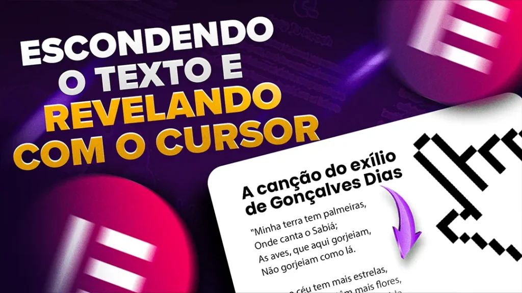
Códigos usado na aula “Personalizando o Cursor do Mouse no Elementor”

CÓDIGO ALTERAR CURSOR
					html{
   cursor:url(' '), auto;
}

html.click, html.click a, html.click a:hover, a:hover{
   cursor:url(' '), auto;
}
Códigos usado na aula “Desativando o Devtools e impedindo acesso pelo Desktop”

					selector{
    max-height: 80px; /*mude para a altura desejada que vai aparecer antes do hover*/
    transition: 0.5s; /*defina o tempo de transição para aparecer o conteúdo. aumente a medida que voce cresce o texto para ficar mais fluido*/
    overflow: hidden;
}
selector:hover{
    max-height: 1000px; /*defina a altura máxima ao passar o mouse*/
}
selector::after{
    content:"";
    position: absolute;
    top: 0;
    left: 0;
    width: 100%;
    height: 100%;
    background: linear-gradient(to bottom, transparent, #170b21 /*defina a cor do fade (de preferencia a cor do fundo que voce esteja usando*/); )
    transition: 0.5s; /*defina o tempo de transição para esconder o conteúdo. */
}
selector:hover::after{
    opacity: 0; /*remove a cor do fade ao sair do hover*/
}
Esse conteúdo te ajudou de alguma forma?
Então já me segue em meu instagram e se inscreva no meu canal no Youtube para não perder nenhuma dica!
Todos os links na BIO.